Light and dark

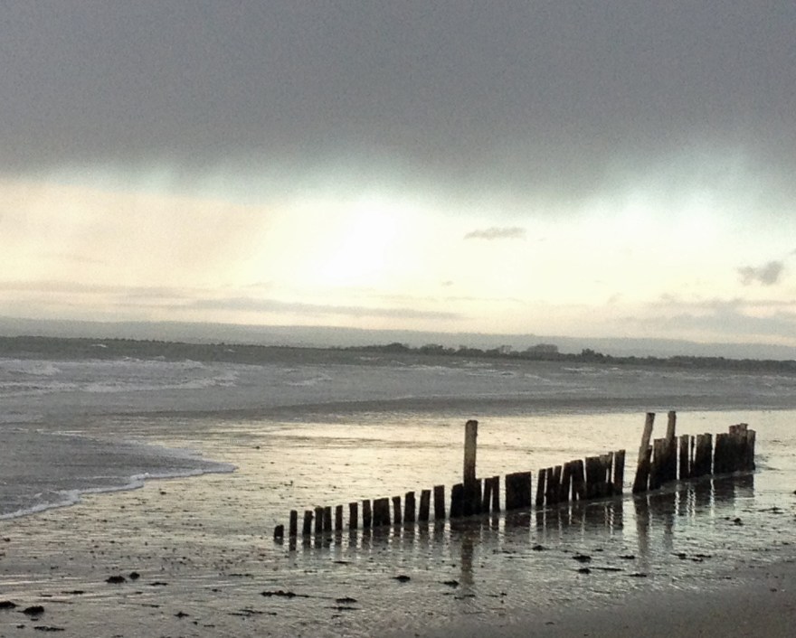
As we enter Autumn I am remembering those days earlier in the year which yielded such lovely shadows.  I thought I would look back at some of my photographs and drawings which made use this striking contrast of tone:
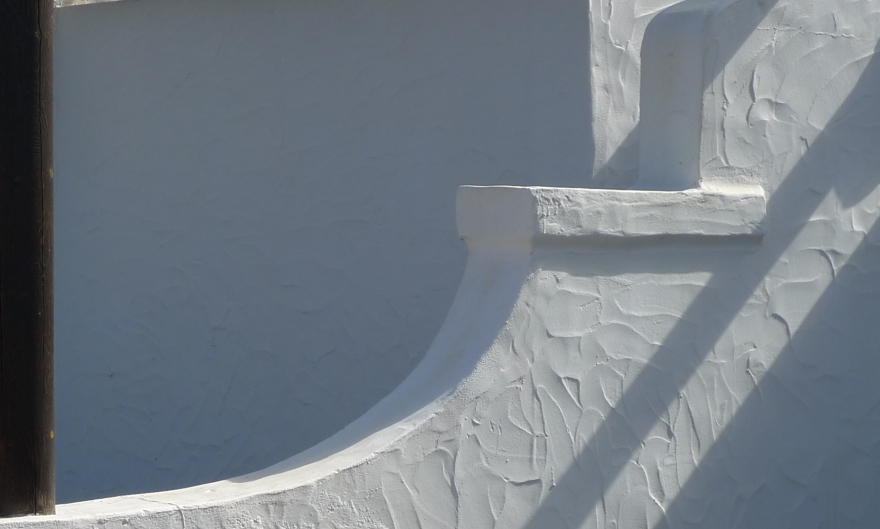
Shadows, Lanzarote

Lanzarote

Shadows at the verge.jpg

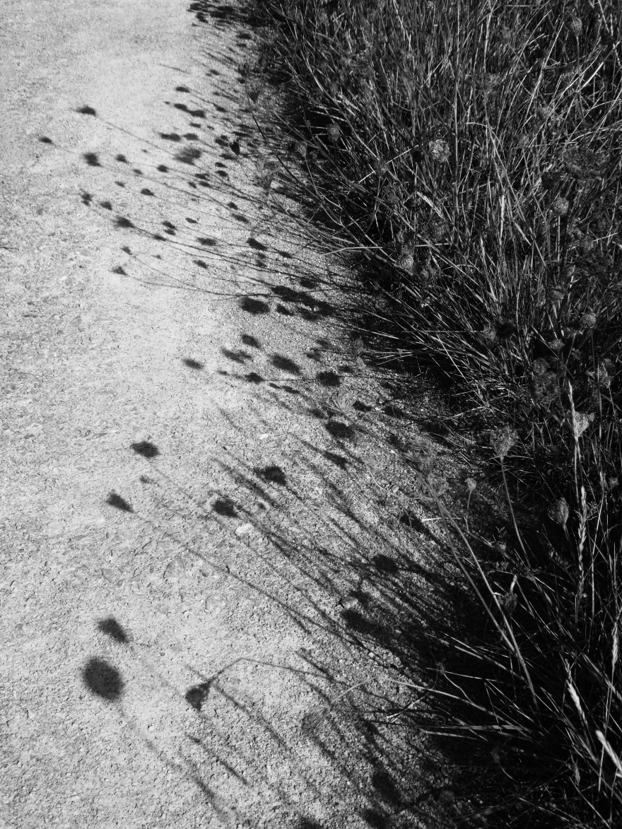
Wild Carrot, Chidham

Elderflower shadow 4.jpg

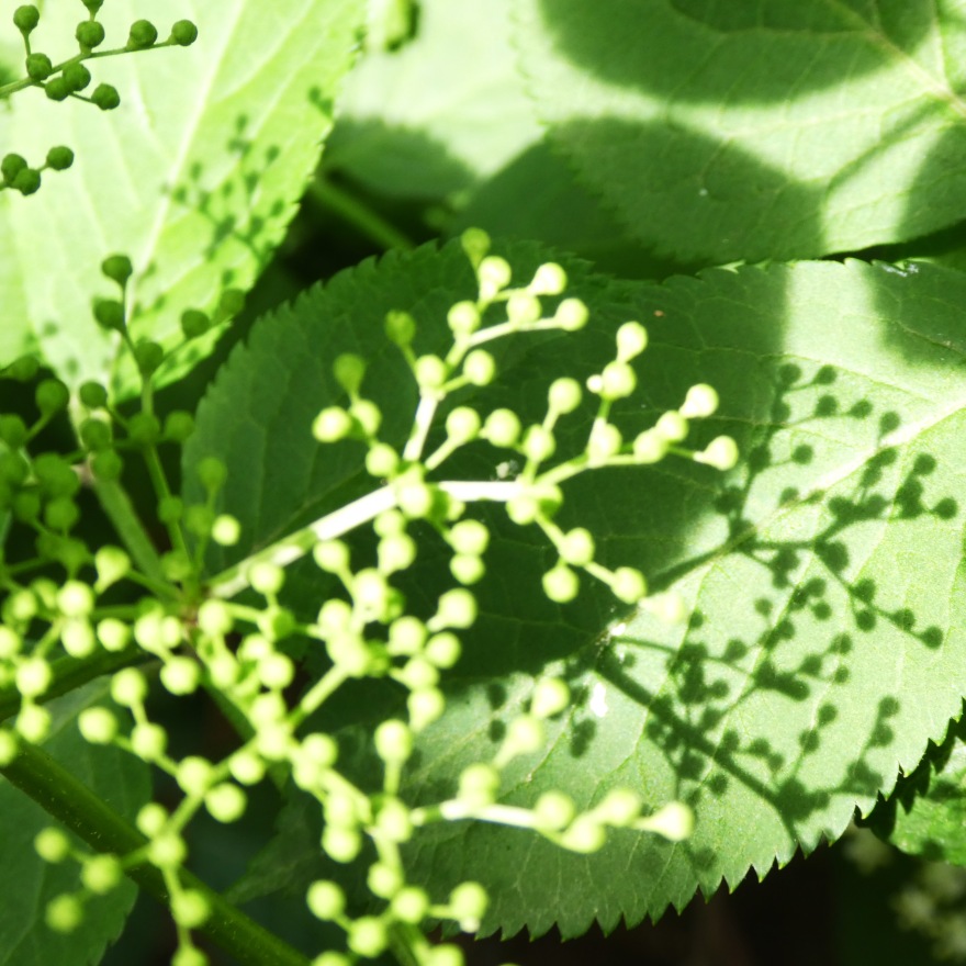
Elderflower, Chidham


What appeals to me with all of these images is the strong dark against light.  Where an image, in photography or art, uses light against dark and then dark against light it is known as Counterchange.

Even a simpler use of dark and light can add drama to an image.  I like to use a limited range of colour in my work and always try and remember the value of white space in a picture.

Quink plus pen at Cowdray Ruins.jpg
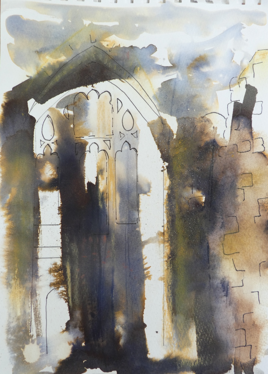
This sketch was worked en plain air at Cowdray Park in Sussex.  The quick was laid down in the studio beforehand and on site, I looked for a view that could use the marks that I had made.

Telegraph poles Stoughton
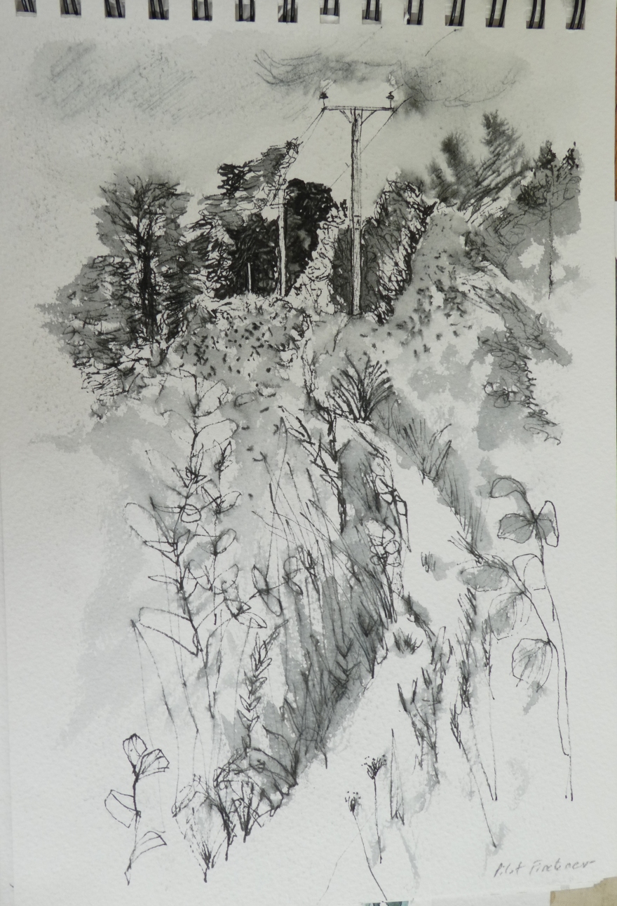
This pen sketch of telegraph poles uses simplicity of tone to create a strong image.  Both of these drawings were undertaken on a course taken by Maxine Relton – you can see her work here.

Close up Wood, Fishbourne
Blurred lines

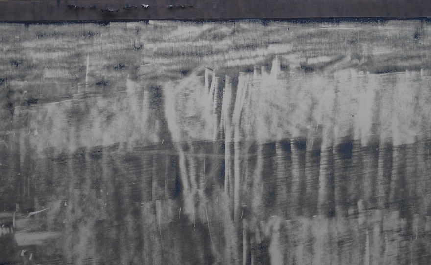
The contrast is much less here but I still like the simple tones.  Working in monotone helps us concentrate on mark making and composition without the distraction of colour and much as I love colour, I find  myself drawn towards a simpler range hues in my work.  What do you think?


Weather

I spent a lovely day at one of my favourite places this week – West Dean College.  Those of us who have completed the Foundation Diploma in Art and Design were invited back for a day to consider the topic of “Weather”.  Our tutor, Frances Hatch, told us of a novel by Giles Foden (best known for the “Last King of Scotland”) called “Turbulence” You can listed to Giles speaking about the novel here and we considered how weather maps might influence our art and how, like the weather,  our art practice ebbs and flows, reaching highs and troughs and shifts from time to time.  We had the option to respond with our chosen media to various pieces of weather inspired music.

I chose to work in two ways during the day.  I wanted to continue my exploration of adding texture to work produced on paper and so started off by using a series of unorthodox tools to work into the blank page before adding colour using a range of mixed media.  I then continued to make marks with my tools and add further layers of colour to build up a more complex image.

By way of contrast, I had also brought with me an old wall tile and wanted to have another go at simple printing using acrylic ink and some newly acquired charcoal powder.  I simply laid down the ink and charcoal (and in some cases PVA glue) onto the tile, put down my paper and pulled it off.  I love the spontaneity of working like this and the fact that serendipity plays a large part in the outcome.

Ink and charcoal powder                Ink and pva glue

The following day, I worked into some pieces a little more and then auditioned a frame, in some cases cropping the original to find a more pleasing image.

These images are all about imagined clouds as it was a bright clear sky on the day itself.  I much prefer a dramatic sky to a cloudless or blue one – in both art and photography:  I’ll finish with a couple of photographs taken at West Wittering and you can judge for yourselves!

December rain, West Wittering

Wittering view June 2017