Light and Shadow

Abstract shapes original

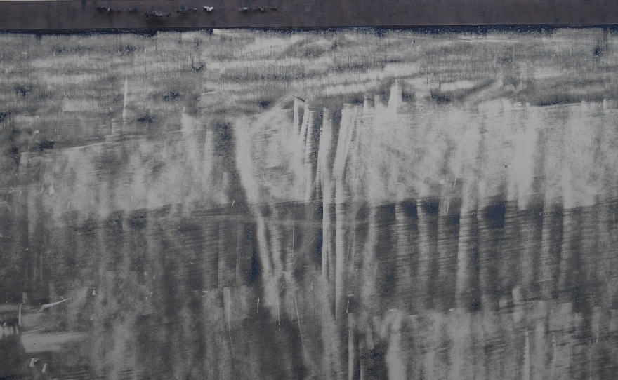
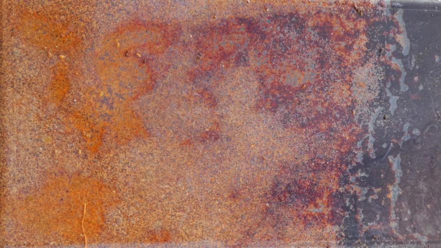
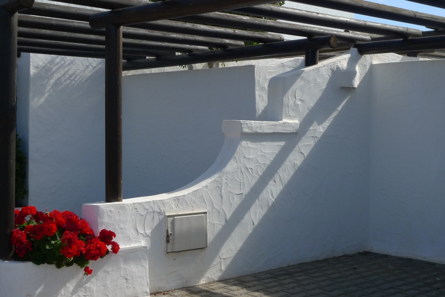
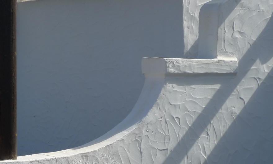
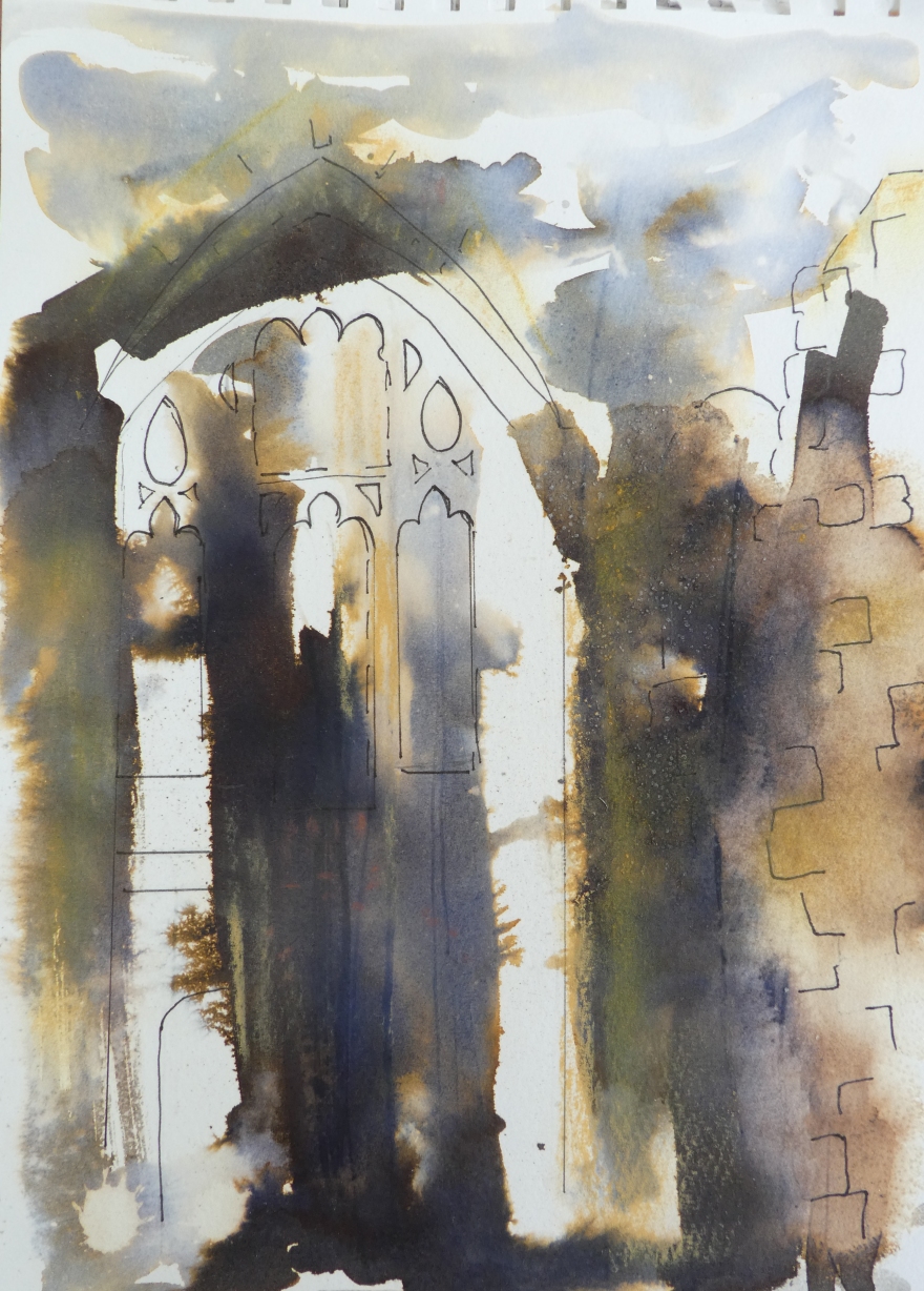
I am almost exclusively interested in landscape in my art work although my outlook is a little broader with photography.  I recently came across the original images that I took whilst on a short holiday in Lanzarote in 2014 and, as I am now further along my artistic path, saw them with fresh eyes.  I was particularly drawn to the shots that I took which considered the strong light and shade of that November in the Canaries where the shadows cast were so different to those that we see here in the UK.  I began to instinctively want to crop them to emphasise the abstract shapes created on the walls around our villa.  I played with photoshop a little, altering light and dark, shadow and contrast and saw that a single starting point could yield a vast range of images by using different crops and treatment.  The next step will be to recreate what is seen here using paper and various mixed media – primarily ink, gels, charcoal and my latest find, cold wax.

There may be a lesson here to show that it is always worth re-visiting work years later and seeing it anew – you may be surprised at the potential in what you had discarded.

Abstract shapes 1

Light and dark 1.jpg

Light and dark 3.jpg

More Walls 3More Walls 4.jpg

Walls Crop II 3.jpg

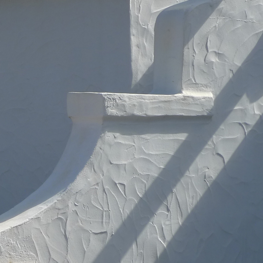
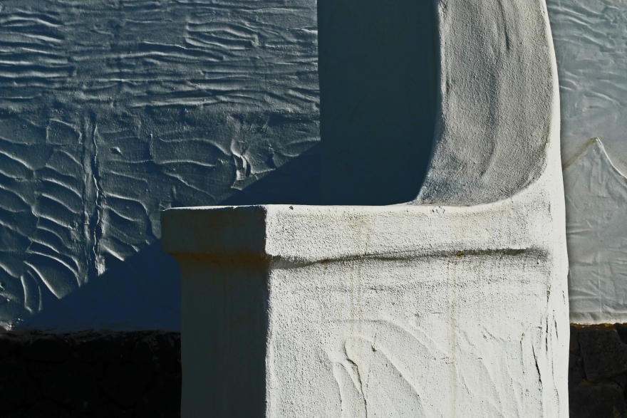
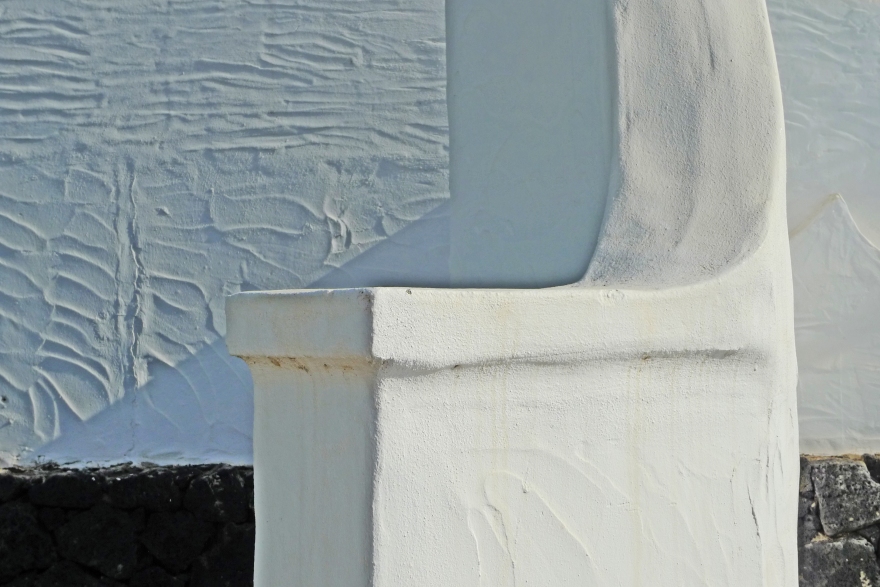
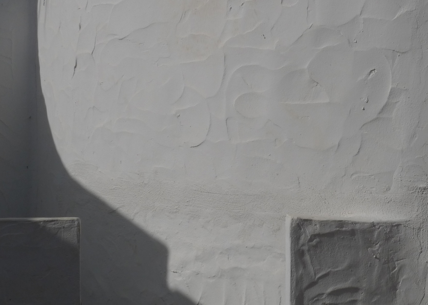
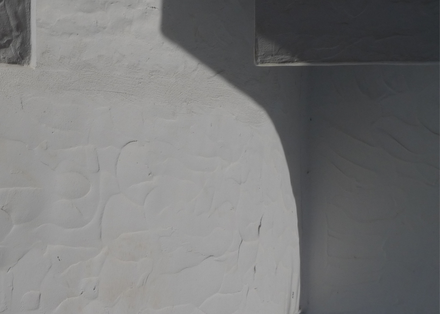
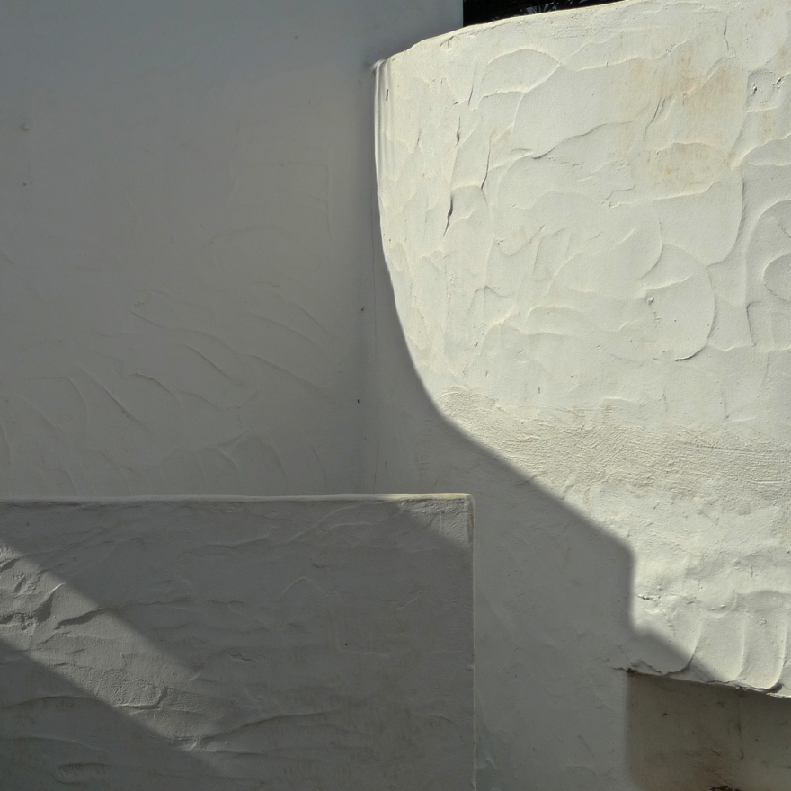
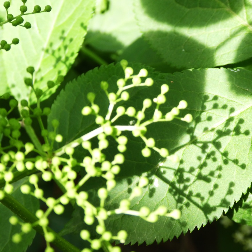
Here are just a few examples – I love the simplicity of form yet opportunity to play with texture that exist here – what do you think?

Light and dark

As we enter Autumn I am remembering those days earlier in the year which yielded such lovely shadows.  I thought I would look back at some of my photographs and drawings which made use this striking contrast of tone:

Shadows, Lanzarote

Lanzarote

Shadows at the verge.jpg

Wild Carrot, Chidham

Elderflower shadow 4.jpg

Elderflower, Chidham


What appeals to me with all of these images is the strong dark against light.  Where an image, in photography or art, uses light against dark and then dark against light it is known as Counterchange.

Even a simpler use of dark and light can add drama to an image.  I like to use a limited range of colour in my work and always try and remember the value of white space in a picture.

Quink plus pen at Cowdray Ruins.jpg
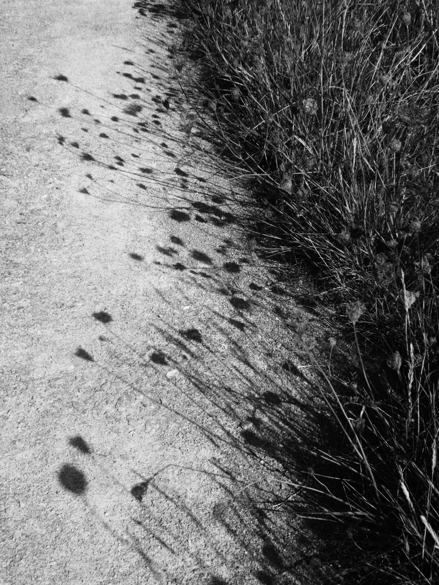
This sketch was worked en plain air at Cowdray Park in Sussex.  The quick was laid down in the studio beforehand and on site, I looked for a view that could use the marks that I had made.

Telegraph poles Stoughton
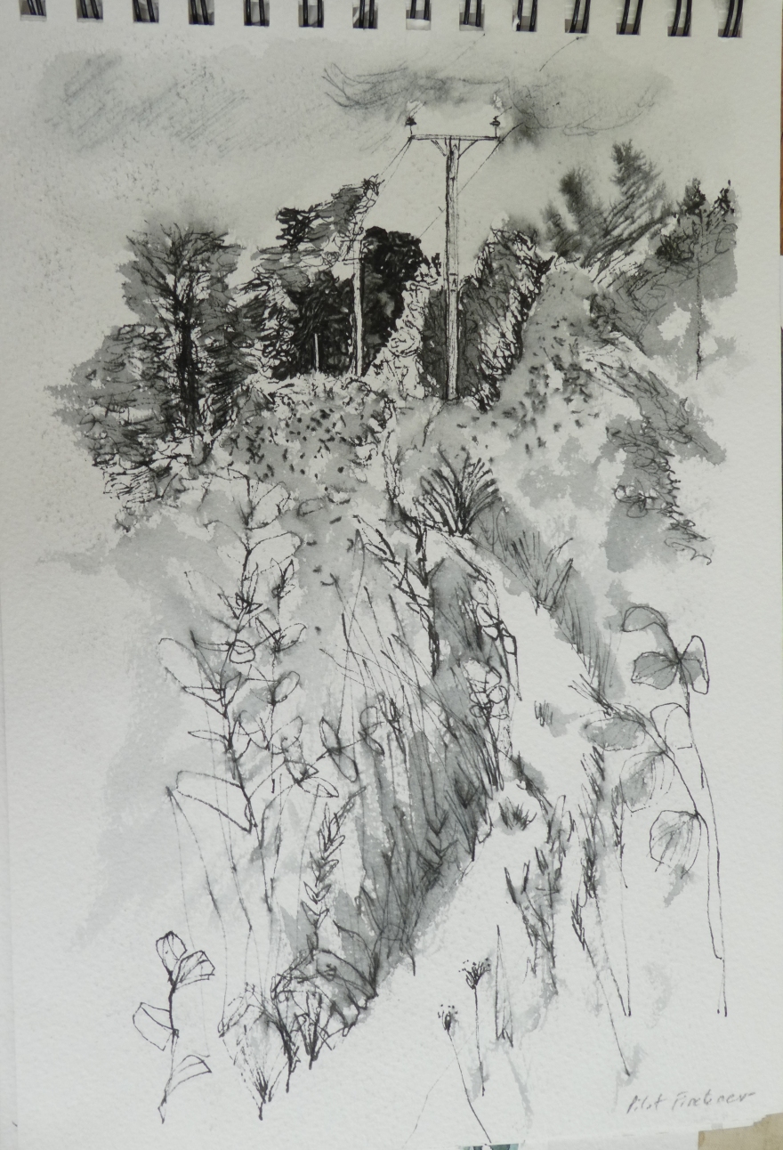
This pen sketch of telegraph poles uses simplicity of tone to create a strong image.  Both of these drawings were undertaken on a course taken by Maxine Relton – you can see her work here.

Close up Wood, Fishbourne
Blurred lines

The contrast is much less here but I still like the simple tones.  Working in monotone helps us concentrate on mark making and composition without the distraction of colour and much as I love colour, I find  myself drawn towards a simpler range hues in my work.  What do you think?


Why you should draw more and photograph less

One of my co-students from West Dean College kindly shared this link describing how our cameras make it so easy to feel we’ve captured what’s important in the world. But to really appreciate what’s around us, we might need to learn a weirder, less technologically-advanced skill: drawing. :

https://l.facebook.com/l.php?u=https%3A%2F%2Fwww.youtube.com%2Fwatch%3Fv%3Dk1eHm0PNnjo%26feature%3Dshare&h=ATMIYXo4Gx08CoBaEpszFkoafhf2DDwHTw_LAa0iXDe51qmIPpG2ZnYu9WjeLvu5fOQ8W1u8n-5yNJQa0mighIK0gyEZpf_LX_bzN8-RsTQT0aGMPi-QxltJ7plLB5DvaC4IQlclBcwxGMommw24-IB4uwTLpLIYSBv1Ygfq43N5VA-TY8geZHB-txfuZxbsCJ-JplQvWvv3FlMeZNaeEcd3Sear6FPpbSfacS7ymthQEvog8gEn4DchoIF4MB2iRbq0j4_5eaQuH1w

which I think follows on so well from what I spoke about last time, in that it is about REALLY LOOKING when you are out and about in everyday life.  I would argue that being a photographer can also make you look but it depends what type of photographs you take.  My husband is an excellent photographer but tends to see the big picture of a beautiful landscape or interior whereas I will always notice the small things.

Sun and shadow on the reed beds, Fishbourne


Found on the beach - Coffee Jar close up 2

The image above is actually a close up of a jar of coffee that had been abandoned on the beach.  I dare say most people would have just seen it as rubbish, but I was immediately drawn to the colour texture and marks made by the random seepage of water into the grounds.  It reminds me of the rust on the burner in the reeds above.