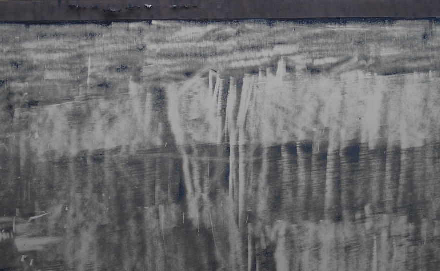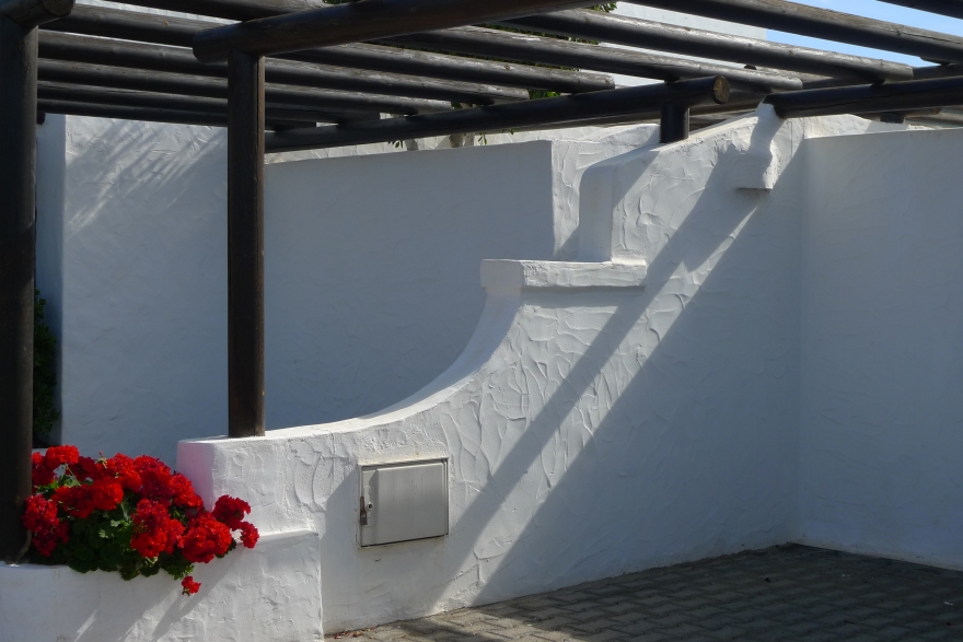
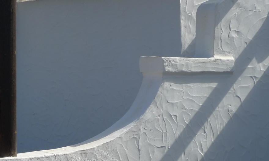
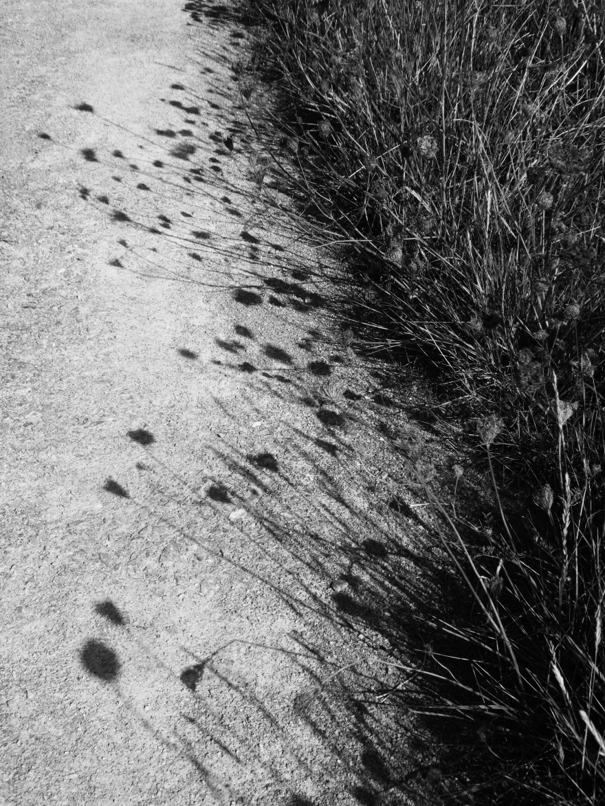
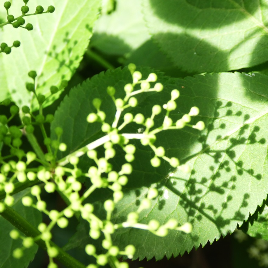
I am almost exclusively interested in landscape in my art work although my outlook is a little broader with photography. I recently came across the original images that I took whilst on a short holiday in Lanzarote in 2014 and, as I am now further along my artistic path, saw them with fresh eyes. I was particularly drawn to the shots that I took which considered the strong light and shade of that November in the Canaries where the shadows cast were so different to those that we see here in the UK. I began to instinctively want to crop them to emphasise the abstract shapes created on the walls around our villa. I played with photoshop a little, altering light and dark, shadow and contrast and saw that a single starting point could yield a vast range of images by using different crops and treatment. The next step will be to recreate what is seen here using paper and various mixed media – primarily ink, gels, charcoal and my latest find, cold wax.
There may be a lesson here to show that it is always worth re-visiting work years later and seeing it anew – you may be surprised at the potential in what you had discarded.
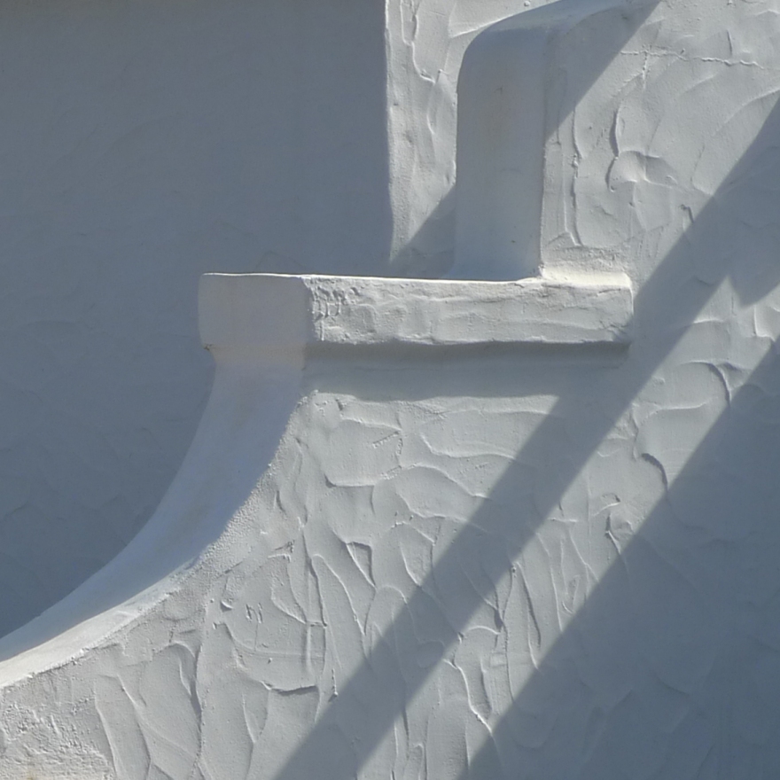
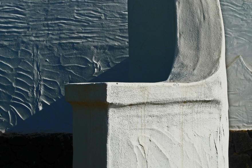
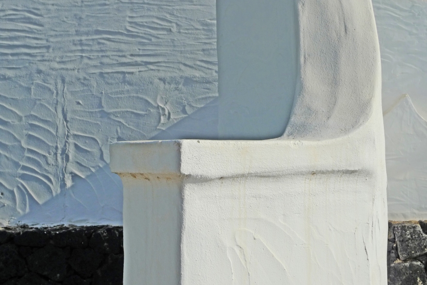
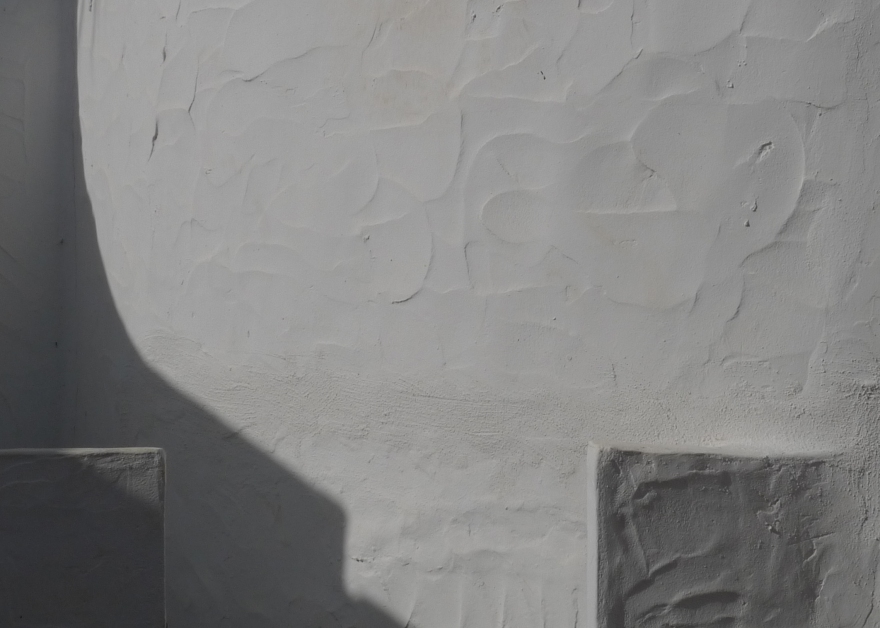
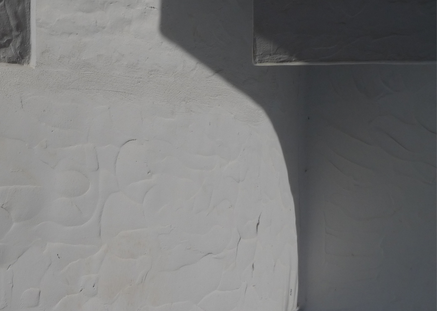
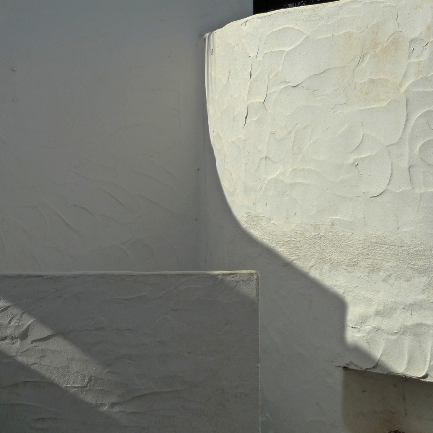
Here are just a few examples – I love the simplicity of form yet opportunity to play with texture that exist here – what do you think?

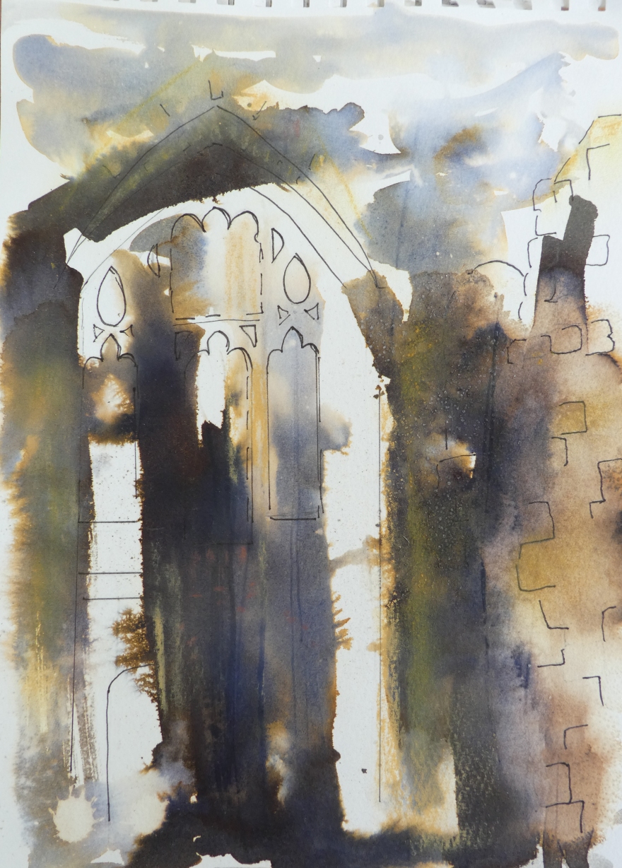 This sketch was worked en plain air at Cowdray Park in Sussex. The quick was laid down in the studio beforehand and on site, I looked for a view that could use the marks that I had made.
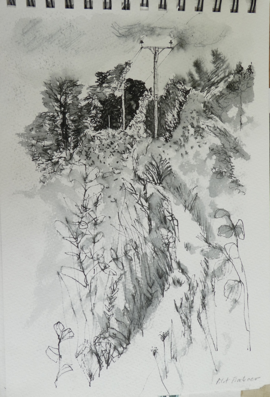 This pen sketch of telegraph poles uses simplicity of tone to create a strong image. Both of these drawings were undertaken on a course taken by Maxine Relton – you can see her work