This is rubbish ….

As you know, I like to collect “rubbish” from the beach.  They say beauty is in the eye of the beholder, and, for me, beauty comprises colour, texture, and composition that appeals to the eye.  Most definitions of art include the need for human intervention.  In the example below, fire and water have done the intervening.

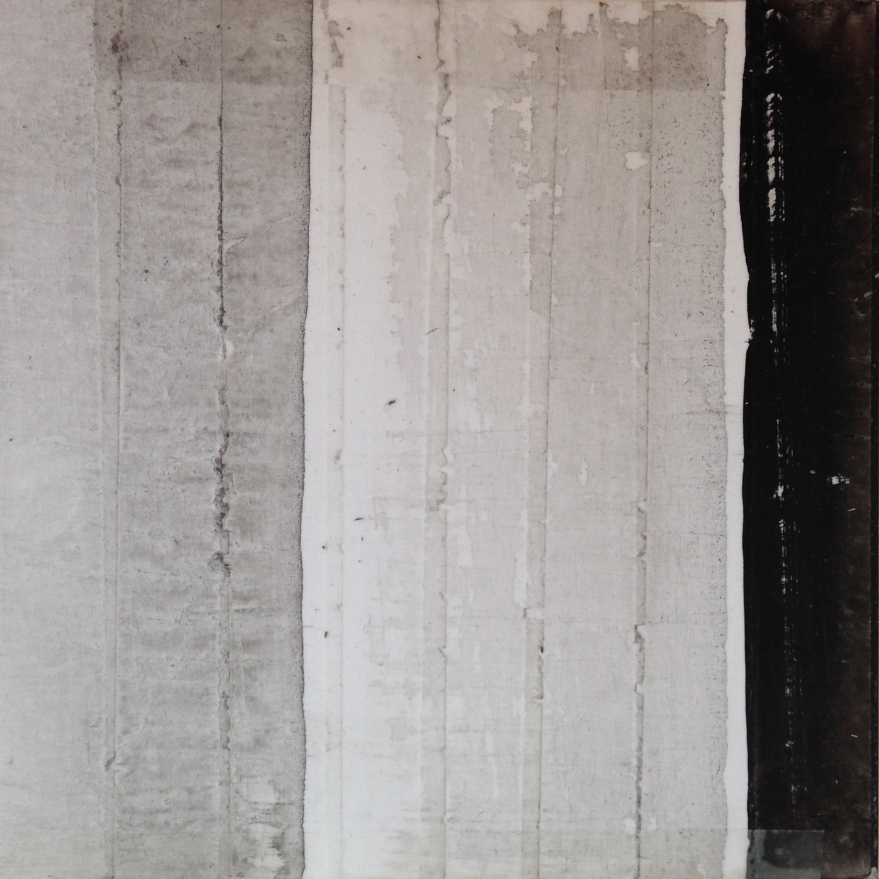
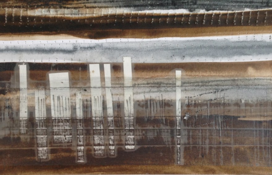
This is the found item on the beach.  It is about 10″ x 7″, weighs 270g and is quite fragile.  I first saw the dark surface and then turned it over:

I was immediately drawn to this item.  I love the complexity of texture that has been formed quite randomly by the bonfire.  I could keep looking at it for ages and keep seeing different areas of interest. There are layers upon layers and whilst it has clearly been burned, there are areas of colour in addition to the expected black and white.  It is very much in tune with my colour palette.

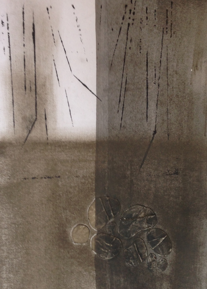
I have recently bought a book by the American collage artist Crystal Neubauer called “The art of Expressive Collage”.  This extract is from the Introduction:  The intuitive artist is the artist who trusts what her eye tells her is good.  She allows for the fact that she has a story to tell through art, but lets go of the notion that the story will be known before she starts working.”  And, in Chapter 1, “Do not stop to question why something has caught your eye.  If it has your attention there is a reason for it.”  This exactly echoes how I feel about my found pieces.  But what next?  First of all, here are the pieces again:

How much better they look without the visual distraction of the stones!  My constant dilemma is to ask myself “Is that enough?” and whilst I consider this found item to be a thing of beauty, going back to the definitions of art such as “The expression or application of human creative skill and imagination, typically in a visual form such as painting or sculpture, producing works to be appreciated primarily for their beauty or emotional power.” (OE) it does not fulfil these parameters because, as yet, there has been no human intervention (or at least none taken with an intention of creating art).

The two sides of the piece are, of course, different and I cannot choose one over the other. The darker side is reminiscent of bark with some lichen growing in places.  The other side includes a bit of seaweed, some metal, a twig, and plastic, foam and melted surfaces can be discerned – it reminds me of lava and also termite nests.

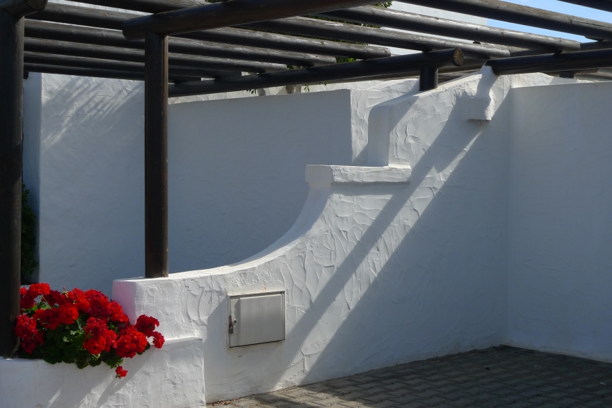
I would like to display this so that both sides can be seen – perhaps mounting it in a perspex box.    The question is – how, if at all, to add my intervention?  Assuming that the piece is displayed in a box, any background pattern would be too distracting unless it was very lightly done.  Perhaps a subtle pale distressed finish would be appropriate but it would have to be done in such a way as to leave the object unobscured from both sides.   Then there is the question of securing it within a box format – I can imagine it suspended but how to get anything through the structure would be a challenge.  Maybe having it on a stand would be a safer option – it cannot stand on its own as it is and I would not want to push one end into a support as it would no longer be seen.

This is puzzle to ponder over a while longer.  I may decide to stick with displaying just one face of the item and that would make the presentation a much easier process.  Any thoughts gratefully received!

I’ll let you know what I decide.  I’ll be seeing our framer next week and he may well have some ideas too.

CHICHESTER ART TRAIL

We’ve done it!!  Alan and I have registered to be part of the Chichester Art Trail in 2018!  We have visited exhibitions many times in the past but this will be the first time either of us have been involved so please put the dates in your diaries (the first two weekends in May – 5th/6th/7th and 12th/13th and see if you can come along!

More details can be found here:Chichester Art Trail – we are looking forward to it!

I have decided to focus on my mixed media/collage pieces on paper and on my contemporary three dimensional work using found materials.  These are the three images submitted as part of the application process:


Alan will be displaying some of his Fine Art photographs – his work can be seen on

Alan Frost

Alan is an Associate of the Royal Photographic Society and works in monochrome taking inspiration from the local area and further afield within Great Britain.

So the game is on: first step is to have existing work mounted.  I will then live with these for a while before deciding which to frame.  Meantime, I want to devote my time to completing more work using my vast stock of found materials – I have many ideas to follow through … watch this space!


Adding Texture … and being brave

I have a need for texture in my work and have been experimenting with different ways of adding depth and texture to my work on paper.  This week I have revisited collage and started to explore a new medium – cold wax.  Treading gently at first, I have added a little wax to my watercolour paper based pieces and am liking the effect.  Here are some of the collage images started recently at West Dean College:

West Dean Collage 3

This next piece was completed in one go – acrylic ink, wax, charcoal and a little collage material from my trusty drawer of bits

Distant cliffs collage
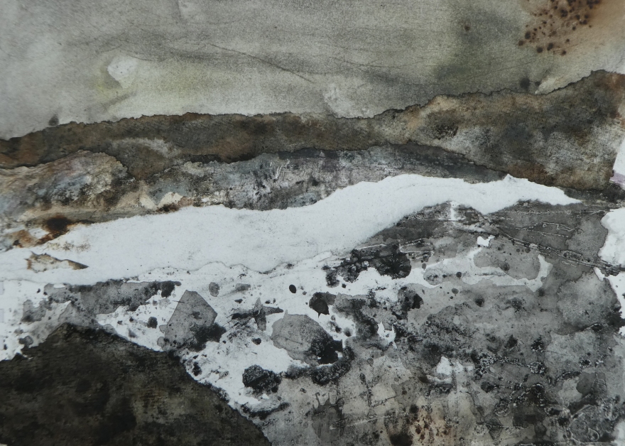
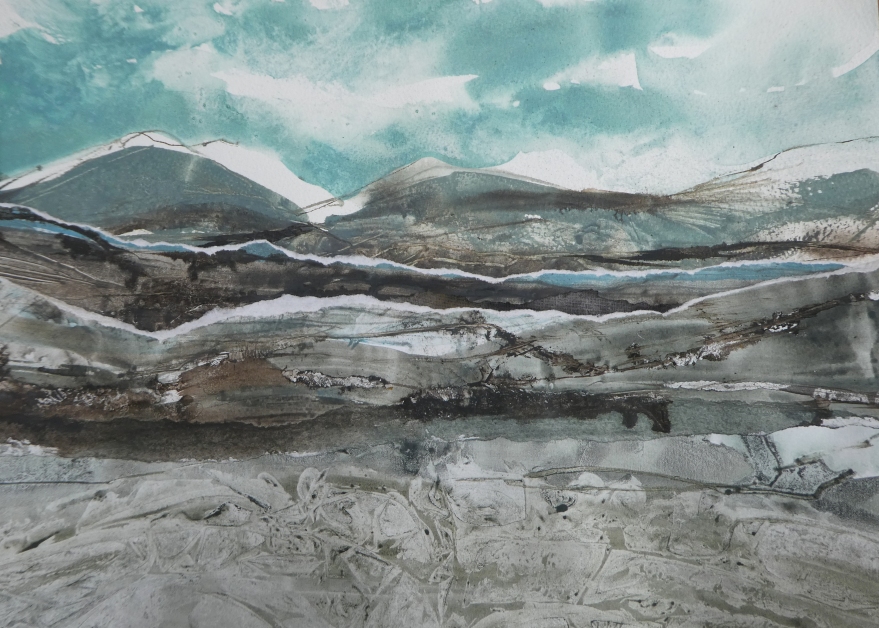
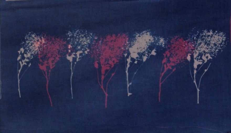
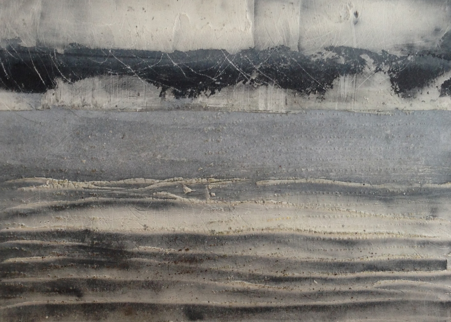
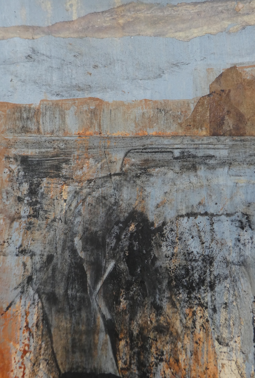
And finally, this one, compiled from three pieces which I did whilst on holiday in Scotland last year.  I had quickly dashed off a series of three sketches – I liked the immediacy and vibrancy of the marks but each felt incomplete.  Remembering what I had been told by Cas Holmes last year, I threw caution to the wind, tore the pieces up and reassembled them – there they are before and after:


Scottish collage

I’d love to know what you think – I won’t be offended so do shout!  Thanks

Light and Shadow

Abstract shapes original

I am almost exclusively interested in landscape in my art work although my outlook is a little broader with photography.  I recently came across the original images that I took whilst on a short holiday in Lanzarote in 2014 and, as I am now further along my artistic path, saw them with fresh eyes.  I was particularly drawn to the shots that I took which considered the strong light and shade of that November in the Canaries where the shadows cast were so different to those that we see here in the UK.  I began to instinctively want to crop them to emphasise the abstract shapes created on the walls around our villa.  I played with photoshop a little, altering light and dark, shadow and contrast and saw that a single starting point could yield a vast range of images by using different crops and treatment.  The next step will be to recreate what is seen here using paper and various mixed media – primarily ink, gels, charcoal and my latest find, cold wax.

There may be a lesson here to show that it is always worth re-visiting work years later and seeing it anew – you may be surprised at the potential in what you had discarded.

Abstract shapes 1

Light and dark 1.jpg

Light and dark 3.jpg

More Walls 3More Walls 4.jpg

Walls Crop II 3.jpg

Here are just a few examples – I love the simplicity of form yet opportunity to play with texture that exist here – what do you think?

It’s all about texture

During my Foundation Diploma at www.westdeanorg.uk I undertook a series of courses working on both paper and fabric.  Reflecting on what I had done over the two year, I realised that the work which got me most excited was that involving texture. Whilst I enjoyed printing in various forms, the flat and pristine outcomes just did not resonate with what I am all about which is texture, movement, mark making,  serendipity, rough edges and a certain rawness.

favourite-trees-on-blue-and-red-fabric-overlaid-e1506176630887.jpg
Cyanotypes

Earlier this year I spent time with the lovely Jilly Morris – doing a course called “Visual language – marks, textures and surface.”  I knew immediately I saw her work that she and I were on the same wavelength and so it proved!  In fact, in between booking the course and undertaking it, a couple of people said, “I know who you should do a course with ….” which further endorsed my feeling.

If you like what I like, I thoroughly recommend a course with Jilly – here’s a taste of what we did – it involved sandpapers, stickers, wire brushes, sticking tape, beeswax, pastels, and WD40 to name but a few!

Jilly Morris 1

Jilly Morris 2Jilly Morris 3.jpgJilly Morris 5.jpg

These are really simple starting points.  Each of Jilly’s pieces comprise many layers and I look forward to further experimentation.  So far, I have been playing with salt and saline solution, lemon  juice, PVA glue and masking tape, liquid soap, candle wax, various polishes, sand, golden texture mediums and cold wax medium.  I am restricting art media to acrylic ink and charcoal powder for the time being.